Tuesday, November 3, 2009

Countdown to Christmas!!

This another "rewind" post of sorts and it includes a couple of my all time DIY Christmas projects that I did last year. I wanted to highlight these now so you would have plenty of time to work on them if you are so inclined. :)

I'll show you a couple of my advent calendars and then show you some inspiration for advents. FUN! First up is my vinyl countdown. I had an Uppercase Living party just to get this sucker for free. (That's how I roll.) In the catalog it says to put it on a pizza pan, but I wanted something I could put anywhere in the house and a pizza pan didn't sound like it would work (more on that later!)

So, I got a round table top from Lowe's, painted it with magnetic paint, then put a coat of white over the top. After the paint was good and dry I put my vinyl on:

(You can click on most pictures to get to last year's posts.)
(Sorry for the poor quality, I'm using last year's pics!) I hot glued a fun ribbon around the edge:
Then got a little wooden tree from Hob Lob, painted it, and hot glued a magnet to the back for the countdown marker:
I love this one. It's fareeeking adorable, yes it is.

As I mentioned last year, it was a very good thing the Bub had no sense of time because I didn't finish up this next project till about 12 days before Christmas. He got day 12 a couple times, day 23 a few...you get the picture. ;)
I just took the cardboard boxes you can find at most craft stores and painted them -- half red, half green. Then I attached paper to the fronts, some fun stickers, brads and stuff. I went a little overboard with the stuff, but that's half the fun don'tchaknow...
This whole advent calendar cost less than $18, because I got the boxes on sale. If you've got older kids they could totally join in and make these with you!

I get little trinkets for the boxes from the dollar store, etc. Starting this year I'll also write down activities we can do together and put those inside. Maybe take a drive to look at Christmas lights, make cookies, watch a Christmas movie, things like that.

Of course after I did this, I saw Carrie's adorable version, that is to. die. for.:
I am considering hanging ours the same way, or even trying to get it into a Christmas tree shape. For now, I kind of like the idea of just one sitting out every morning for the Bub to open. Less temptation for him. ;)

Here are some other fun ideas I found looking around the net...

Speaking of pizza pan advents, this one turned out soooo adorable, I kinda wish I had seen this before I did our round one! Love the ribbon woven through!:
(Click pics to go to the source site.)

Something as simple as pails would be sahweeeet with some spray paint and numbers:
You could hang them anywhere!

I LURVE this idea!! Match books covered in fun paper with numbers attached:
This one would be only for written activities but I love that idea. (And how GORG to put them in an apothecary jar! Gleeee!) The site I found this on was from years ago and she got it from an old magazine, so sorry there is no source for this one.

I scanned this one from my Women's Day holiday mag -- same idea, but on a corkboard:
Oops! She did it again... Martha never fails to amaze me:
Little bubby socks! With little bitty bubby clothespins! Ack.

Here's a similar version, I think this person made the stockings herself. If you sew, this wouldn't take long at all!:
Here's another Martha version using old Christmas cards:
A cutie felt calendar with pockets:
(Which could be used for just about anything, depending on the colors you use.)

These are from an Etsy shop (click pic) but look easy enough to make on your own:
Ohhhh, I know! I know! What about doing them in red velvet or felt and adding a little bit of white fluffy trim around them to look like Santa sacks?? I'm dyin' here! Could that be any cuter??

By the way, that's a hint for an upcoming Christmas project I'll show you soon!

Have you seen any other great advent calendars out there? If so, share them in the comments!

The Before and After Party will be open and whooping it up till this weekend, so link in or visit the party! And I have a fantabulous molding project to show you later this week -- with my first video. Egads. That is, unless I find my senses and decide to nix that part. We'll see... ;)

Sleek Venetian Blinds To Compliment Kitchens Perfectly


Don't be a slave to your kitchen! Rather than rushing around like a maniac when waiting for a cake to bake, simply take it easy in relax in a kitchen which has been designed to suit modern living styles impeccably!

I'm not sure if bright candy pink would be my colour choice or the arm chairs, but I do like the area which has been designated to relaxation within a kitchen. This beautiful sunny window has the ideal window covering for kitchens; humble Venetian blinds have seen a recent revival within many kitchen interior designs. Easy to install and practical, you can see just how versatile they are. Enabling you to have complete control over the amount of natural sunlight entering the room, when used at windows of all shapes of sizes you can have them pulled up at different levels to give a very chic and stylish look which is both practical and affordable.

Opt for a neutral colour such as the latest in-trend graphite or steal colours as these compliment all colour schemes effortlessly, particularly in kitchens to coordinate with steel accessories, stainless steel sinks and cupboard handles.

Sleek, shiny and spotlessly clean kitchens don't have to be places in which you are slave to the sink or cooker, take time to relax whilst you fill your home with mouthwatering smells of homemade bread and cakes!

Image: AtticMag

Monday, November 2, 2009

My 70s Split Redo Part III: The Kitchen

(Click for Part I: The Living Room/ Dining Room , Part II: The Family Room) warning: I use the word "love" a lot in this post because I'm just so happy with the space.


Well, I finally took some photos of our finished kitchen. You've probably seen lots of of midstage pics, but I have to say, I've never been happier with the kitchen than I am now. If you remember back in April/ May, here's what it looked like before: maple arched cabinet doors, yummy flourescent light fixture, dirty linoleum...

And here's what it looks like now:


We ripped down all of the uppers the first weekend we moved in & Dave put up beadboard & shelving. The whole thing was under $150 or so. We replaced the kitchen floors with click & lock Elm from Home Depot (read details here) at the same time we did the rest of the house. The cabinets are painted in Behr's "Witch Hazel" in semigloss. (For prep, I sanded them down with a hand sander, cleaned them & then just painted them with the semi-gloss.)
We added inexpensive nickel drawers pulls and knobs from Home Depot:
Now remember my appliance disasters??!! Well, the dishwasher from the Stone Age is back to being painted the same color as the cabinets. I used the exact same seim-gloss paint and did no prep for it. (I really recommend this if you have no money for new appliances... it just sort of recedes & your eyes doesn't really catch it at all..) It's nothing pretty to look at for sure, but it's better than the beige it was originally.
And thanks to you all I LOVE my fridge painted in chalkboard paint!!! I never would have thought of that on my own & after so many of you suggested it to me during the appliance diaster, I gave it a shot & I just love it!!!
It's a great spot for "to do" lists & pictures and the black works with the counters & shelf hardware. And, as you can see, Christian really loves it too:
I found the chandelier on the first flea market tour we took with Eddie & Jaithan. I debated & debated about buying it but walked away & Eddie offered to pick it up for me & mail it if I changed my mind. Well, a week or so later, I decided to go for it & Eddie & Jaithan were sweet enough to go back & buy it & mail it to us. Originally it was going to be for my dad's house but when we moved into our new place I knew the kitchen would be perfect for it! (I still have intentions of adding pretty wax drips on it but that's another day.)
As I've said before, I love having my shelves open: it makes my life easier. I can see everything at a glance & things are so easy to put away & grab.
People have asked me about dust and we use almost everything up there all the time so it's not an issue, but for the occassional cake stand or seldom-used bowl, I simply rinse them out before using & it's honestly no big deal. And I love all of the things that I have up on the shelves that I've been given & have collected over the past few years. This way I get to see them all:
Everything on the shelves is either white, cream or silver. (usually aluminum or stainless) and I love the combination.
I've shown you this before but it's my Grandma Maestranzi's colander:
thrift-store bust I painted white:
And I had to take a pic of the cakestand full of gorgeous cupcakes that my friends made for our Halloween party this weekend: yum yum!!
And you know how much soup we eat in this house so I just hung the silver ladle right on the wall between two nails next to the stove for easy-access:

And I also wanted to explain my decision on the black $3 Home Depot shelf brackets I chose for the shleving. I had received a comment or 2-- my dad being one of them :)--- in a previous post suggesting switching out my cheapie Home Depot brackets with pretty wooden brackets. And also to add moulding to the shelves & walls. And I do think that would be a beautiful kitchen, but my house is very simple & contemporary & clean-lined. As much as I love ornate woodwork, there's not really a place for it in my home. Antiques work, but I tend to go for clean-lined ones such as Gustavian or Shaker... I want to stay true to the architecture of the house & while we've made lots of changes, simple & straight is where I want things to be in this kitchen, so I'm actually really happy with them:

Below are a couple of other views of the kitchen 'before':

We turned the little lost counter into a bar area by adding these wine racks from Pottery Barn and stocking the cabinets below with drinkware & drinks:
The pic below makes me laugh because there's so much empty space in our wine racks. ahhahaha With me being pregnant, we're not really buying much wine so it'll be empty a bit longer:


Here's a bunch of our pretty wedding gifts that I love seeing displayed. People (the moms) used to be paranoid about us having our Waterford crystal out and bumpable & breakable, but to me it's one of those things that you just have to use & so what if some break?


We covered the doorway to our pantry with dropcloth curtains & it's great for hiding the organized mess that lives in there:
I found the plates at Lucketts! shocker. (but they work so well with my wallpaper!! :)
Here's our little breakfast nook before:
And here is is now: wallpapered with a vintage saarinen reproduction table, thrift-store found Swedish chairs, smith + noble bamboo shades, and a chalkboard (oh yeah & Target booster seat! ;)--
We really love it & eat most meals here. I used a pair of Murray Feiss crystal sconces from our old house & painted them black so they'd work here... We so needed them to add some light to the space for nighttime meals. I got the wallpaper for a steal but unfortunately it's been discontinued. :( (I wanted more but oh well.)
Originally this was "the" chalkboard in our kitchen. (below) We probably seem chalkboard-crazed because now the fridge is also a chalkboard, but my originally intentions were to have one place for menus. I got these topiaries & am adding lots more rosemary into my meals lately because it's right there for the picking. One of the topiaries is fake.. (hee hee hee I know how bad fake plants are but it's a pretty good fake & seems to fool people since two of them are real.) So far the topiaries are still alive and I am so proud of myself!!!
As you can see, there are still a few things that will need to be upgraded some day, but for now I have the look & the feeling I wanted in my kitchen: it's both light & airy & a little cozy... It's a mix of old & new, food prep & clean-up are a breeze, and it's one of my favorite places to be in our house. (It also makes me want to add wallpaper to other rooms now!! :) Hope you enjoyed my too-many-photos-and-words tour!! ;)
xoxo,
lauren

Sunday, November 1, 2009

Before and After Party!

It's a par-tay people!!
I feel like I should title this post "Lamp Pass and Lamp BIG FAT FAIL." I recently redid two lamps and only one turned out like I had hoped. The other...well...notsogood. The first started when I found this cutie little drum shade at Goodwill for $2.99:

I am quickly becoming obsessed with drum shades. I just think they are uber cool. I had been wanting a new shade for the lamp on my self-made sofa table in our living room for ages. The shade I had there was just so GINORMOUS:I was just going to cover the denim, but when I went to remove the trim, it all came off pretty easy. Then I realized I could just peel the fabric right off the shade. Who knew?:

I had some extra fabric from try No. 2 with our dining room drapes years ago, and I covered the shade with it like I showed you here.
Drum shades are easy peasy to cover, no angles to worry about. ;)
For the unfinished edges on the inside, I always add a little trim (also from another project):

A little hot glue does the trick!
The trim also helps to cover the uneven fabric that you wrap around the top and bottom. The fabric looks fine without trim covering it until you turn on the light -- then it shows all the edges.

Loverly!:

This one is a pass, right? I think so. I absolutely love it!
The next one...well. I'm not so sure about. I wanted a new lamp for our dresser in the bedroom and was on the lookout for something with a cool shape at Goodwill. I found this one for $7.99, brand new with tags:I LOVED the shape and size. The color of the wood, not really. I already have three spray painted lamps in our bedroom, so I was really hoping to stain this one instead.

I sanded this sucker down with my electric sander because the finish would just not. come. off. otherwise:
I was so stinking excited, thinking how GORG it would be with my walnut stain!

Uhhhhhh....no. It looked like total butt. It was so uneven and just grody. I didn't even take a picture because I was so totally annoyed I had just spent all that time sanding the blasted thing.

So, once a spray painter, always a spray painter I guess:
Oh yeah, I know it looks OK from afar. I sprayed it with my oil rubbed bronze paint, and it's OK. But oh my goodness, the finish is SO uneven. It's a Mona Lisa -- you know the type. Looks good from far away but when you get close...ewwww...

It's not the crack that bothers me, I like that. Dang it! The pictures don't do this thing justice. For the first time in eternity, the picture looks BETTER than real life. How often does that happen? Usually it's the other way around. I am OK with it...it's staying so when I get over my tiff with this one, I'll work on it more... ;)

So what before and afters have you got to show off today? I can't wait to see!

You know the drill -- use the link from that post, not to your blog, to link to the party. (I have to delete those -- and I don't like bein' mean!!) :)

design that would be more beautiful when combined with good lighting arrangements of modern lighting


Colacril has presented a new tub that is part of the design project - Atmosphere by Romano Adolini. The tub was impressed with the simple shape and really minimalist design that would be more beautiful when combined with good lighting arrangements of modern lighting. With geometric shapes as possible to save space and can be placed as central in the bathroom near the wall. Combination polished like the exterior and interior matte and smooth, and unique lighting of a lamp in the corner of the room makes it very beautiful and able to decorate a modern bathroom. This minimalist bath made of ecological materials and the product itself polymineral presents a real health.
Lighting lamps must use a soft white light or using direct sunlight during the day. [via]
learn more>>>>>

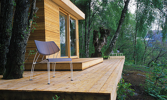
woodsy Norway Summer Getaway


While this is technically more than a room of the house, I was eager for this secluded, woodsy Norway Summer Getaway. Part of the attraction is the location, of course. Located in the 170-kilometer-long Hardanger Fjord, this area is filled with beautiful scenery of reason, with waterfalls, glaciers, gardens, fields, and mountains to choose from. I can imagine filling the nights long summer with a bike or kayak trip is interrupted by a cold reduction in the fjord and followed with a glass of Aquavit in this modern deck.
more>>>>>>CLIK HERE
 
coompax-digital magazine